Nickelodeon Notebooks
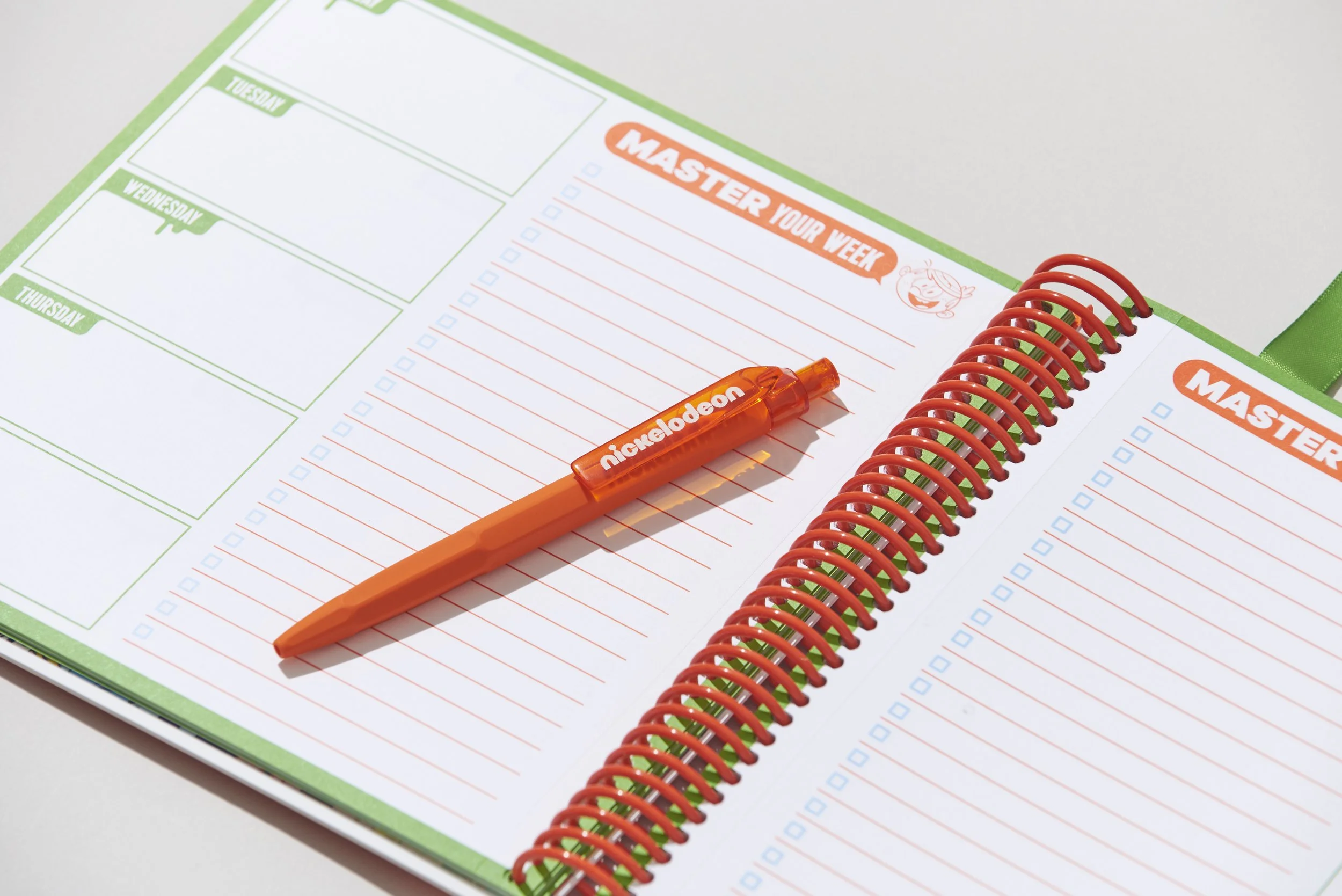
Each year, Nickelodeon’s internal ad sales team requests a Nick-themed notebook to promote the brand and give to external clients and partners. The brief contains a skeleton framework of what to include - covers, calendars, activites, text pages, bookmark and pen. It's up to our team to push boundaries on printing materials and keeping our brand feeling refreshed each notebook iteration, along with developing and concepting different printed activities.
The two highlighted notebooks are from the years 2020 and 2024. 2020 featured a soft touch die cut cover into a character pattern, inner gatefold timeline, and retro stickers. The directional emphasis remained on the iconic colors of nickelodeon, and the brand before it's 2022 rebrand.
In contrast, the 2024 notebook focused on the look of the SpongeBob 25th anniversary campaign while including touches of the 2022 Nickelodeon rebrand. As part of the campaign, we commissioned artists for the four different covers so that it was a surprise which one you got upon receiving the book. The back featured holographic foiling, while the inside included SpongeBob stickers and punch out character bookmarks.
I've been involved in designing the yearly notebooks since 2016. In the two featured, both were projects I spearheaded and managed along with designing and concepting a majority of the internal components.
Disciplines Covered
Editorial Design // Packaging // Project Management
Credits
Design Director, Nickelodeon // Jane Trieu
Associate Art Director, Nickelodeon // John Kutlu
Designers // Madeline Persson, Tiffany DeJesus


